"StayEasy": A Hotel Booking App
Reading Time: About 5 Minutes

Design Brief
My role: Lead and Solo Designer
User Research, Benchmarking, Testing, and Prototyping.
The task was to design an app for a fictitious hotel booking service I named ‘StayEasy’.
I had to create an online booking experience that is simple, accessible and was based on a deep understanding of the target users.
The Problem: Sign-up issues, date selection, and unclear terms on the reservation summary page were three areas of friction users were facing that I decided to focus on during the design.
As the sole designer, I approached this challenge by initially conducting user research on a variety of hotel booking apps. I synthesized this research into an affinity diagram, customer journey map, and a user flow of what I would later design by.
After several sketches and low-fi prototypes, I ended with my goal of creating a high-fidelity prototype and a set of annotated wireframes that could be handed over for further development.
Research
Competitive Benchmarking
First, I decided to benchmark against the key players in the hotel booking industry. Following are the three benchmarks I chose.
1. Booking.com
2. Expedia.com
3. Hotels.com
During this exercise, I took note of conventions, flows, and possible pain points.

Usability Testing:
My second stage of research was reviewing usability tests of two participants using two hotel booking apps, 'Barcelo Hotel Group' and 'The Doyle Collection'.
I also conducted my own usability test with Hotels.com and Booking.com, and took notes on this research.
Analysis:
With a sizeable amount of qualitative research, I decided to use two analysis methods to interpret the data. The affinity diagram and customer journey map provided a framework for understanding users in the process of booking a hotel on these platforms.
I ran an affinity diagram session with a classmate who was also designing a Hotel booking application. We combined the most relevant research and collaborated on the online whiteboard application Miro.
Workflow
In our diagraming session, goals, behaviors, pain points, and other observations were represented by a sticky note; each an individual data point.


We organized our research into categories, then refined the categories, creating subcategories, and finally sequenced these into a visual representation of the user's journey.

Final Groupings
Main Takeaways:
In this process, pain points were represented with red tags on the bottom of the stickies. It was easy to spot the groupings and contextualize the sections which had a problem.
For example, the 'Calendar' grouping had 8 separate pain points. The 'Payment' and 'Reservation Summary', which could be combined, had a total of 11 pain points. 'Sign-up' issues, which occurred in several groupings, mostly because of pressure throughout the flow, would total 10.
Below are just a few examples:
-User stated he “nearly put in the wrong dates” because of functionality.
-Only problem with the app is you cannot continue as a guest.
-User nervous about 'cancellation window' before booking.

Section containing many pain points
These decidedly were the main areas of focus going forward during the re-design. But I still was wondering, "How can I put a value on how negative a negative interaction is?" I decided that producing a customer journey map, with relating emotions will help narrow down my insights and provide another visual representation to framing this problem.
Customer Journey Map:
Here I asked, "What is already being done in which makes the user happy, and how will I need to replicate that in my designs?" And more importantly, "Where are areas of improvement?"
It was useful to framing sometimes conflicting data within columns, as one piece of information represents the problem, the other can help solve it. I ranked the emotional aspect of a given stage of the flow on a scale of 1-5. When pain points outweighed positive interactions, the emotion was ranked lower. This reinforced areas needed for improvement:
-
Reservation screen
-
Calendar
-
Sign-up

Design:
Flow Diagram:
I then needed to create a high-level flow focusing on just one use case: The happy path of a user booking a hotel for leisure. Focusing on issues highlighted in the CJM, this document laid the framework on which I would later build my designs.

.jpg)
.jpg)
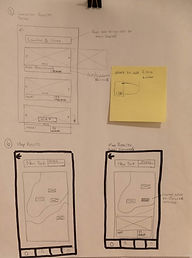
Sketches
With my user flow, I had a general idea what the context of each screen would appear during usage of the app. However, visuals had not been explored yet. Therefore, I had to start sketching with pen and paper, and outline screens to be designed.
Many iterations were drawn and many pages were scrapped. The sketching provided an opportunity for rapid brainstorming. I had to return to my competitive benchmarking work for inspiration on the layout of several screens, but keeping in mind the solutions I was trying to provide to the product.


Goals
Sign up:
-Make sign-up as painless as possible & reduce sign up pressure
-Give the ability to continue as guest
-Create a clear CTA to sign up for a rewards program
Calendar:
-Create efficient calendar navigation through tap and scroll
-Improve micro-interactions, such as eliminating the need to tap into and out of each field (Check-in & Check-Out). Reducing this stage to just three taps.
-Provide the User with feedback during the journey to confirm the chosen dates are correct.
Reservation screen:
-Ability to view and edit important details about stay
-Transparent cancellation policy
Prototype
After defining much of the solutions within the user flow and sketches, I created a medium-fidelity prototype in Figma. This prototype shows a greater detail of the user interface, interactivity, layouts, and text and colors one would see in a final product to be developed.

Homepage

Sign Up Screen

Calendar Re-design

Hotel Page

Map Feature
Annotations
I then created a set of annotations, defining the extra details a developer would need to build this product accurately.


Payment Screen
Main Search
Conclusion, takeaways
As a solo designer, who took on the scope of creating an entire booking app, I was limited by the challenge of budget and personnel. There are several features and interactions that could be developed much further with this case study, but much of that would require a larger team.
If there were no limitations, a few things that would add utility and improve quality of UX would be: a full profile page, with preferences, wishlists, booking history, search filters, rewards information, legal information, and improved map functionality.
Usability testing was essential during this design process. It was during this testing I discovered that Users want to be able to search for Hotels without having to buy into anything; that people use these apps to get into the 'Holiday mode.' Overbearing sign-ups, poor search functionality, and confusing review of details will result in Users more likely to leave the app then to go through the conversion tunnel. By improving just these three areas, users are able to view more and book more hotels.