UX Design · Case Study · 2023
StayEasy — A Hotel Booking App
Designing a fictitious hotel booking service from scratch — grounded in user research, competitive benchmarking, and iterative prototyping.

Design Brief
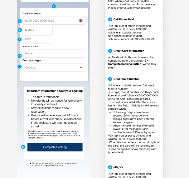
The Problem: Sign-up issues, date selection, and unclear terms on the reservation summary page were three areas of friction users were facing that I decided to focus on during the design.
As the sole designer, I approached this challenge by initially conducting user research on a variety of hotel booking apps. I synthesized this research into an affinity diagram, customer journey map, and a user flow of what I would later design by.
After several sketches and low-fi prototypes, I ended with my goal of creating a high-fidelity prototype and a set of annotated wireframes that could be handed over for further development.
Research
Competitive Benchmarking
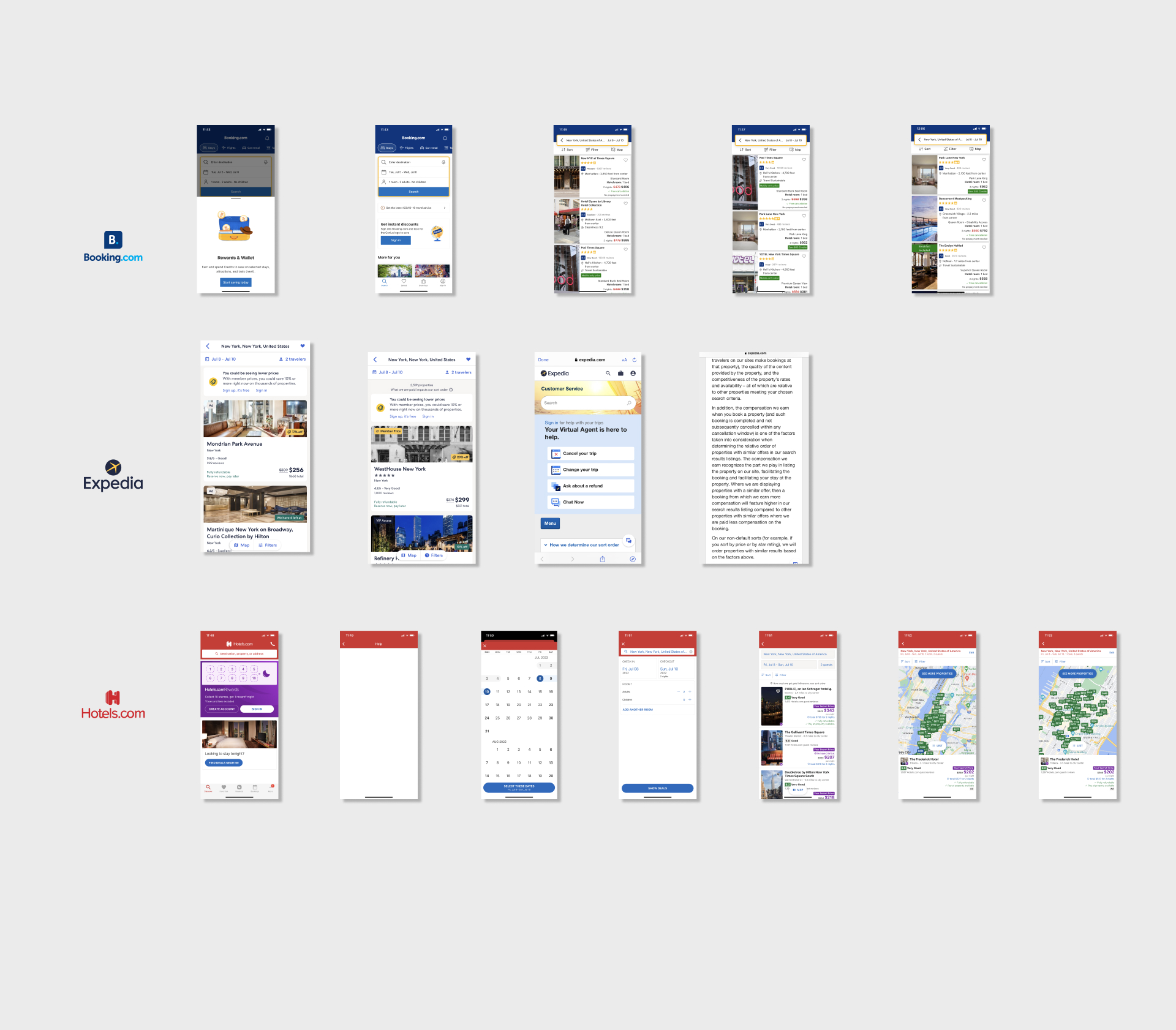
First, I decided to benchmark against the key players in the hotel booking industry. I took note of conventions, flows, and possible pain points.
- 1. Booking.com
- 2. Expedia.com
- 3. Hotels.com
Research
Usability Testing
My second stage of research was reviewing usability tests of two participants using two hotel booking apps, 'Barcelo Hotel Group' and 'The Doyle Collection'.
I also conducted my own usability test with Hotels.com and Booking.com, and took notes on this research.
Analysis
Affinity Diagramming
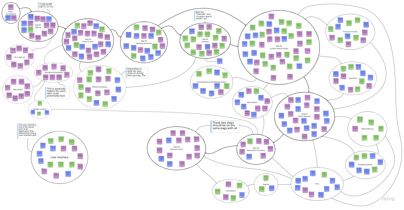
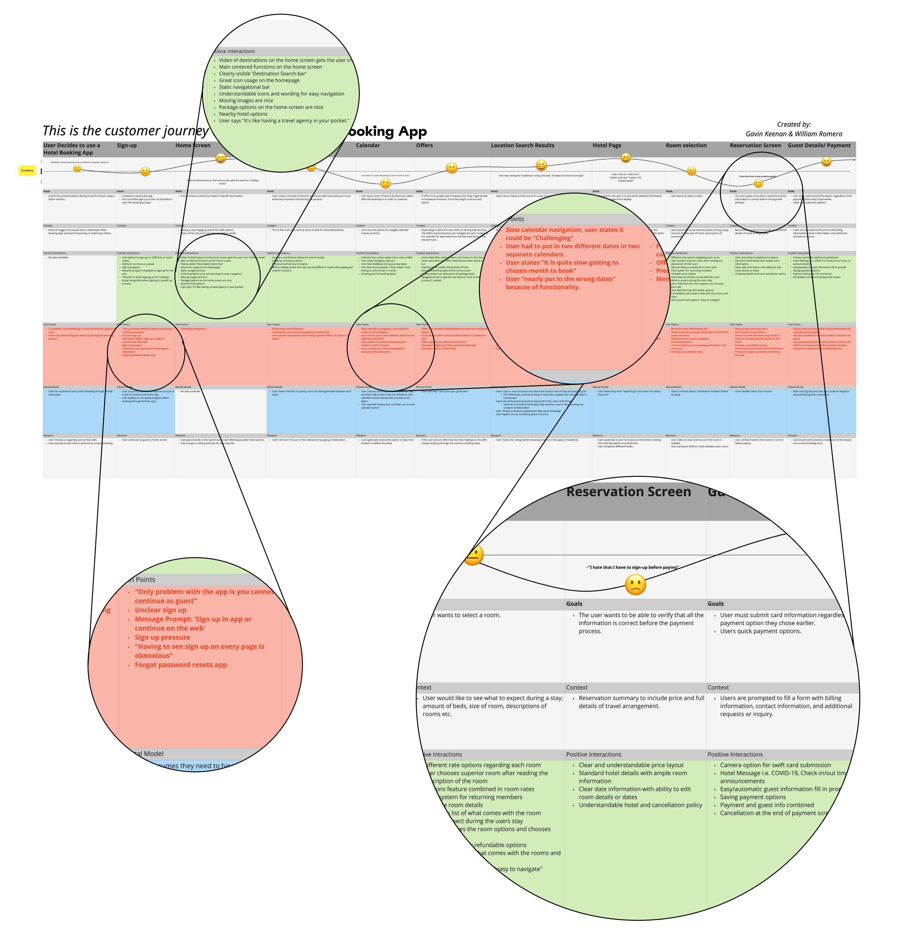
With a sizeable amount of qualitative research, I decided to use two analysis methods to interpret the data. The affinity diagram and customer journey map provided a framework for understanding users in the process of booking a hotel on these platforms.
Process
Workflow
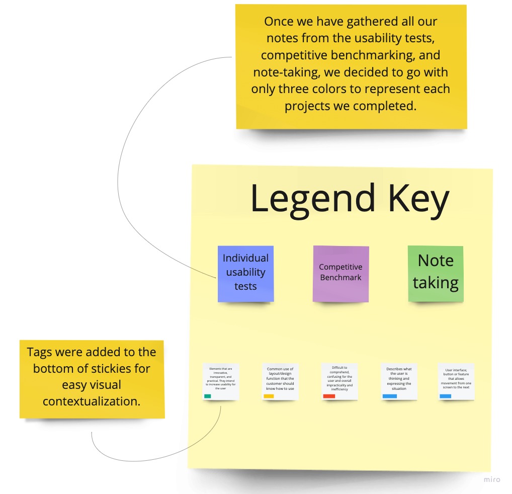
In our diagraming session, goals, behaviors, pain points, and other observations were represented by a sticky note; each an individual data point.
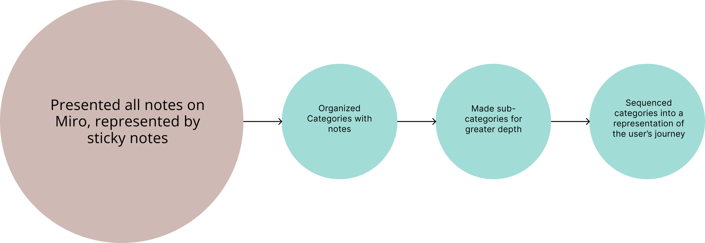
I organized the research into categories, then refined the categories, creating subcategories, and finally sequenced them into a visual representation of the user's journey.
Findings
Main Takeaways
In this process, pain points were represented with red tags on the bottom of the stickies. It was easy to spot the groupings and contextualize the sections which had a problem.
For example, the 'Calendar' grouping had 8 separate pain points. The 'Payment' and 'Reservation Summary', which could be combined, had a total of 11 pain points. 'Sign-up' issues, which occurred in several groupings, mostly because of pressure throughout the flow, would total 10.
Below are just a few examples:
- User stated he "nearly put in the wrong dates" because of functionality.
- Only problem with the app is you cannot continue as a guest.
- User nervous about 'cancellation window' before booking.
Outcome
Final Designs
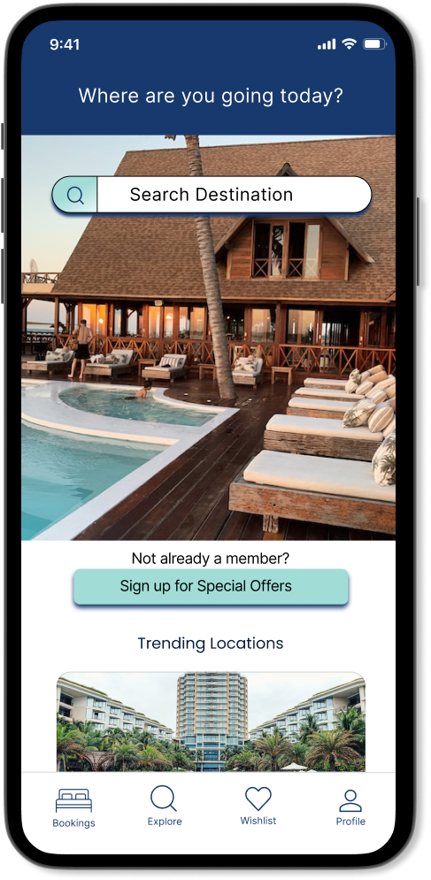
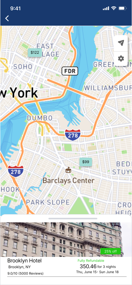
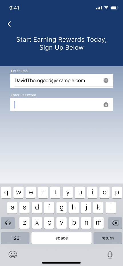
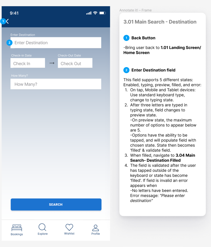
After defining much of the solutions within the user flow and sketches, I created a medium-fidelity prototype in Figma. This prototype shows a greater detail of the user interface, interactivity, layouts, and text and colors one would see in a final product.