UX Design · 2025
Drexel University Libraries Component Redesign
Redesigning two critical utility components; Library search tool and library hours
Design Brief
Library Search and Hours

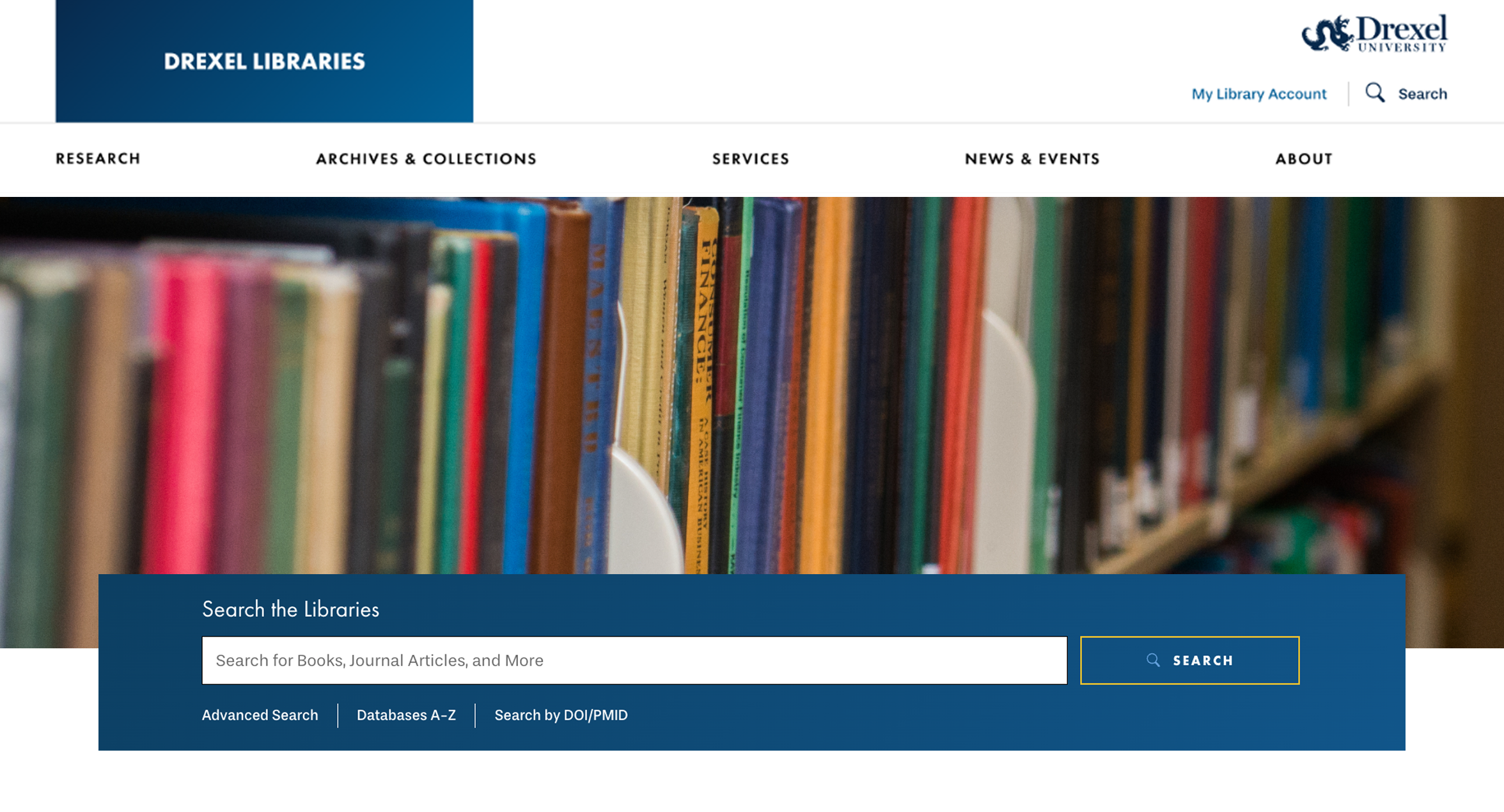
The Problem
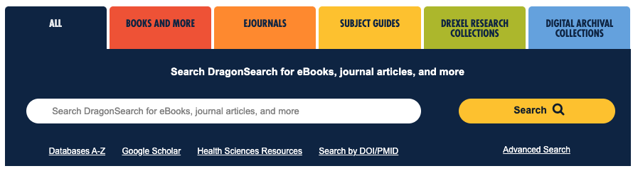
Search
The legacy search display was inaccessible on mobile, contained six search options in tabular format. Tabular search bar that gives the percieved function of filtering, but doesn't actually filter anything, creating a cluttered interface.
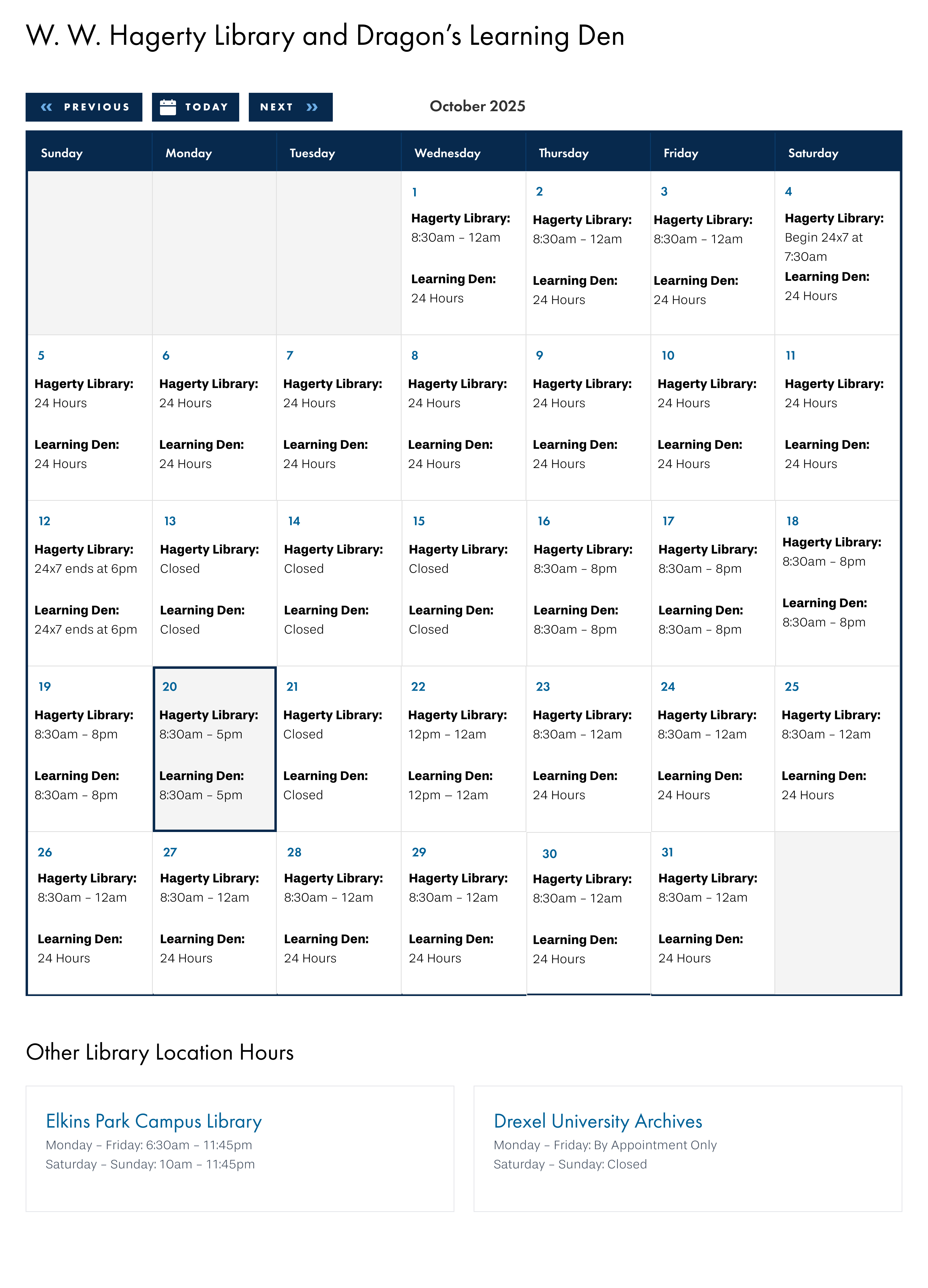
Hours
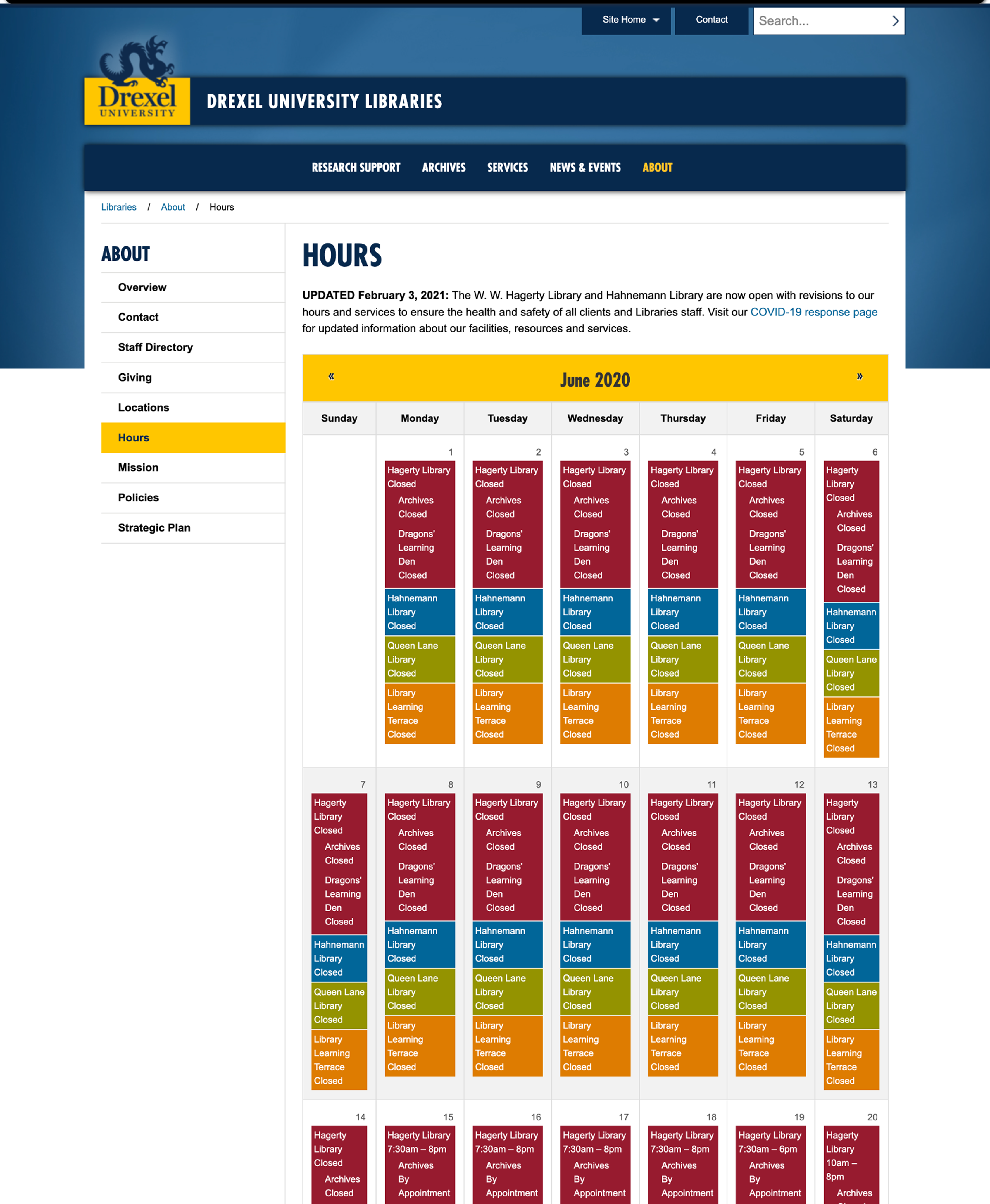
The legacy hours display prosed a unique design challenge, in that it attempted to display four colored bars stacked inside each day cell. So every day square on the calendar is essentially a tiny mini-table comparing four locations, and the whole month is that pattern repeated 30 times.
- On dekstop, Most people show up wanting to know one thing: "Is the library I care about open right now?" This design instead shows them every library, every day, all month — whether they wanted that or not.
- It's visually exhausting, and buries the most important information.
- On mobile, the legacy hours were inaccessible to all users, .
Process
Design Exploration
Search
Designing a search that leads the page. I designed it as the primary action — large, centered, and unmistakable against the hero imagery. Surrounding clutter was pulled back or relocated so nothing competed with that single, clear path forward. A few principles guided the direction:
- One clear call to action.
- Imagery that sets tone, not noise.
Process
Collaboration with Accessibility Team
We aimed to support assistive tech users while also handling the realities of a small screen.
- Touch targets sized and spaced to stay comfortable for thumbs and users with limited dexterity.
- Color and status cues paired with text and icons so meaning never relies on color alone.
- Screen reader support so status is announced clearly — including live updates when hours shift, like moving into "closing soon."
- Flexible text and fallback states treated with the same care as the default view, so nothing gets clipped, cut off, or leaves the user guessing.
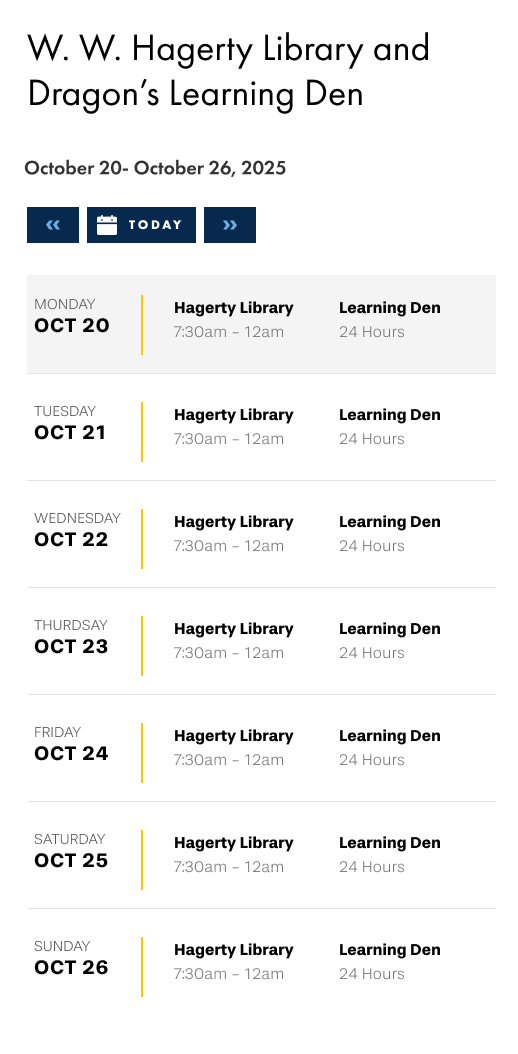
The hours component adapted for mobile — a compact, touch-friendly layout that surfaces today's hours without scrolling.
Findings
Main Takeaways
Usability testing of the prototype with twelve student ambassadors confirmed the component resolved the core friction seen in the legacy component. Across the board, all participants found branch hours quickly and confidently — desktop and mobile alike.